Sunday, May 15, 2016

la belle blanche

Hello lovelies!
We've been finally printing out shirts this week, but since mine isn't quite done I thought I'd just wait to put up the final part until next week when I actually have a shirt to show you. :) So for the present time, here's a quick watercolor of Blanche Ingram from Jane Eyre. 


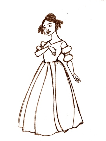
Here's my original lineart sketch.


I tried a bit of digital coloring on an app on my phone and it turned out okay enough that I thought I would show you :)


When I designed Blanche, I wanted to make sure she was very different from Jane since they're foils. So I picked a bright pink as opposed to the darker, more serious colors in Jane's wardrobe, and I chose one of the fussier hairstyles of the period for Blanche to contrast Jane's simple low bun hairstyle. I took inspiration for all the characters from late 1840s fashion, since the book was published in 1847, but I pulled elements of Blanche's clothing from late 1840s to early 1850s to show her concern with being on top of all the latest fashion trends or the time. Jane's dresses are based on styles of earlier in the century, simpler with narrower skirts. I wanted to show both that Jane doesn't care as much about fancy clothing, and that she is poorer and doesn't have access to the modern dressmakers and fashions that Blanche does. I think a key part of Jane's character is that she chooses to act and do what she believes is right, instead of going along with the flow; she believes she has more important things to do than sitting around looking pretty. So I tried to show that she's not buying into that idea by having her dress be something simple that she can actually move around in, rather than a more ornate dress like Blanche wears. (Not that I have anything against fancy dresses-I mean, have you seen the dress in the new Cinderella movie?!? Or Christine Daae's beautiful poofy dresses? Or Marianne Dashwood's wedding dress? Or-okay, I'd better stop now. Not great for moving around getting things done in, but GORGEOUS. There's a place for that, of course. :) I just don't think a poofy fancy dress is true to Jane's character.) I also wanted Blanche's dress to show her personality-appearances and impressing others are very important to her, hence the fuller skirt, fancy sleeves and bright colors to draw everyone's attention to her. 

So those were a few of my thoughts making this design! Thanks for reading, and I'll see you next week when I will hopefully have a completed t-shirt to show you!

Sunday, May 8, 2016

screen printing: part 2

Hello, dearest readers!
I have a few more screen printing pictures for you today.

The next step is called emulsion. To prepare the screens, they have to be coated with a thick emulsion fluid that blocks the holes in the screen so no ink can get through during the printing process. 


This is what my screen looked like with the fluid on it. 


Now, let the emulsion fluid set in overnight by keeping the screen in a dark place. Light exposes it and I don't want that to happen except on the parts where the design will be.

This is the screen the next day after being in a dark cupboard for a 24 hours. :)


Next, it's time to expose the screen! You place your design inside the exposure machine . . . 


. . . then place your screen in over it, close the lid, and turn on the vacuum mode to suction the screen and the design close together. Then you run the exposure mode for a minute and 15 seconds before taking it out.


The machine sounds kind of like a spaceship while it's going (I wish I had taken a video now!)


When you've finished exposing, you rinse the screen to get off the exposed emulsion. This should leave the screen clear in the area where your design is so ink will come through only on the areas of your design. 

I would have taken pictures of this, but here's the problem: the emulsion fluid we were using did not work for some reason. We're thinking it might have been too old, unfortunately. So sadly, I have to redo the steps I took in this list! It's not a big deal, though, and I hope to have some more pictures next week. I'm actually rather pleased because I have some posts ready to go in the next few weeks-Rae kindly tagged me in a blog award, so I'll be doing that soon, and I have another drawing I did for my Jane Eyre project to share at some point. I'm excited to share them with you! Thanks for reading!

Sunday, May 1, 2016

screen printing: part 1

Hello lovely readers!
Sorry about the radio silence over here last week. . . I have no excuse other than that I've been busy, but I'm back this week to talk about another project my design class is doing: screen printing. We're designing and printing our own t-shirts! I finished my design this week and have some process pictures to show you. 

Step 1: the design itself! I used one of my favorite quotes from Beatrice in Much Ado About Nothing. It's my favorite Shakespeare play and I absolutely adore this line in particular. Beatrice is such a fantastic character!

I wanted to do a flower wreath but could only do two colors (because the difficulty of screen printing increases with each additional color in a design), so this is what I finally came up with. 


Step 2: I created two separate documents, one for each color and put the corresponding design elements into each one, then converted them to black and white. Then I printed them out separately (on Special Paper!)


Step 3: Combining the designs. I had to fiddle with them a bit to line them up the way I wanted, and here's the result!


Stay tuned for more in the epic screen printing saga!