"I want to do something splendid before I go into my castle, something heroic or wonderful that won't be forgotten after I'm dead. I don't know what, but I'm on the watch for it, and mean to astonish you all some day." -Louisa May Alcott
Monday, December 14, 2015
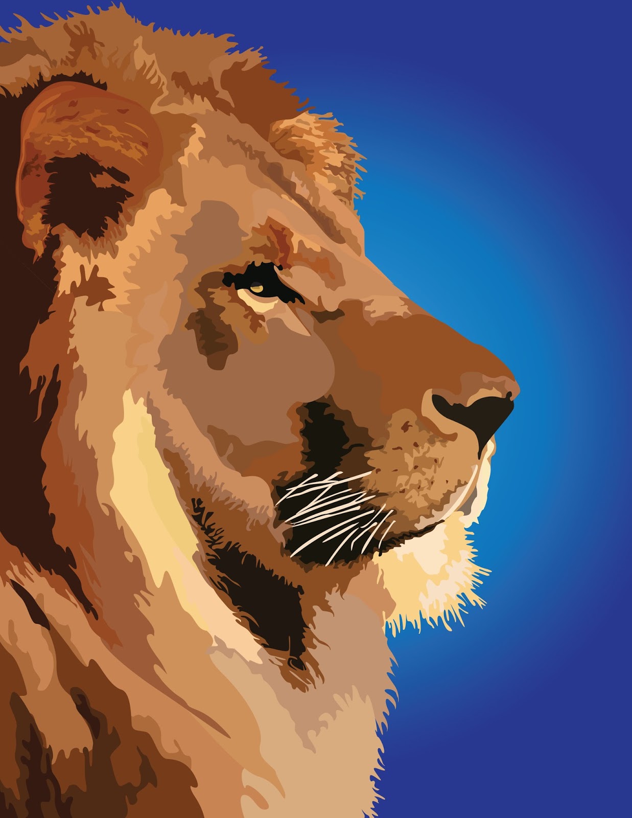
"he's not a tame lion"
Hello everyone! This is a snippet from a WIP from my design class which I'll hopefully be able to share soon. Adobe Illustrator and I are becoming fast friends, despite my earlier frustration:)
Let me know which background color you like best! I'm kind of feeling the first one but I included the others because I'm trying to get comfortable with creating gradients.) Have a lovely week, wonderful readers!
I personally love the yellow, I think it has the most life and conveys the idea that he's NOT a tame lion in a way the cooler colors don't. But the blue has a royal feel which is nice. This is an incredible piece! I want to dive into digital art but I don't have the tech:)
I totally agree-the hard part about the yellow one for me was keeping it contrasting to the lion itself, so I thought the blue might be better with regard to contrast-but the yellow one really does bring out that "not a tame lion" aspect. Thanks for the feedback-I really appreciate it :D
I love getting comments, so please tell me what you think! I moderate comments, so don't worry if yours doesn't show up right away. I try to reply to all my comments, so be sure to click the "notify me" box so you can see replies! :)


Very nice and I love the quote you used as a title. ;) I think I like the first one best.
ReplyDeleteThanks! The first one is one of my favorite versions as well :)
DeleteI personally love the yellow, I think it has the most life and conveys the idea that he's NOT a tame lion in a way the cooler colors don't. But the blue has a royal feel which is nice. This is an incredible piece! I want to dive into digital art but I don't have the tech:)
ReplyDeleteI totally agree-the hard part about the yellow one for me was keeping it contrasting to the lion itself, so I thought the blue might be better with regard to contrast-but the yellow one really does bring out that "not a tame lion" aspect. Thanks for the feedback-I really appreciate it :D
DeleteI like the first, or the yellow-gold one, but I'm no artist! :)
ReplyDeleteThanks :D Those were my two favorite ones so I'm glad you like them as well :)
Delete